PROJECT #7

Love yourself

PROJECT OVERVIEW

“show up for yourself.”

This project is a linear, interactive narrative experience that explores self-love as a practice through time and attention. Rather than functioning as a traditional game with complex mechanics, the experience uses minimal interaction to guide users through a reflective story. Difficult or tiring days can have a meaningful long-term impact. Interaction is intentionally limited to maintain pacing and reinforce the emotional tone of the piece.

GAME

Link to my game is below.

ANIMATION
PROJECT ELEMENTS

Concept development and narrative definition

Initially, I only had the core message I wanted to convey—“show up for yourself”—but I didn’t have a clear direction for turning it into a narrative. I discussed ideas with Megan and also considered the skills I wanted to develop through this project, such as creating animated pieces for my portfolio and building an interactive narrative.

During the brainstorming phase, I explored different concepts with guidance from Megan, including symbolic ideas such as showing a plant growing. This process led me to the idea of cleaning up a room as the central narrative. I chose to keep the story within a single scene so I could focus more on developing the scene and refining the story.

Visual research and style exploration

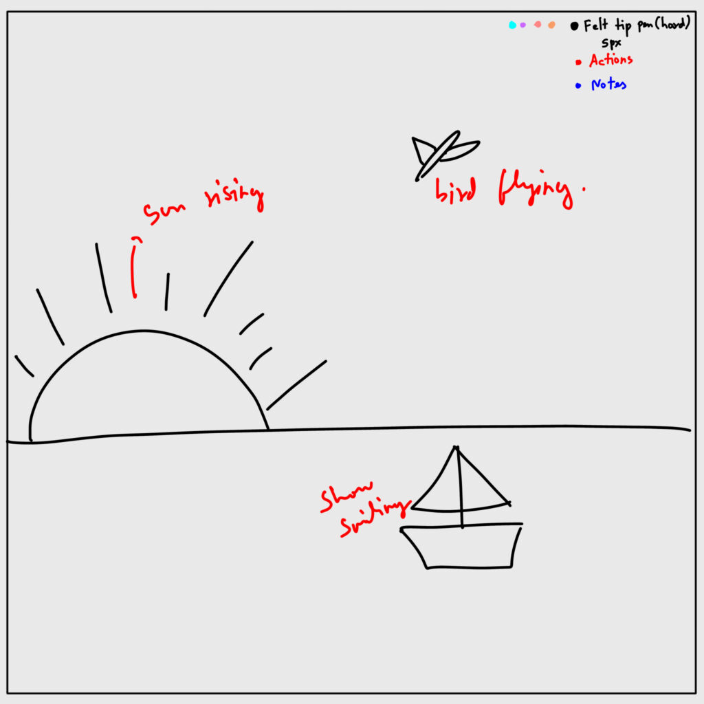
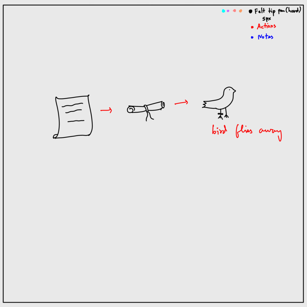
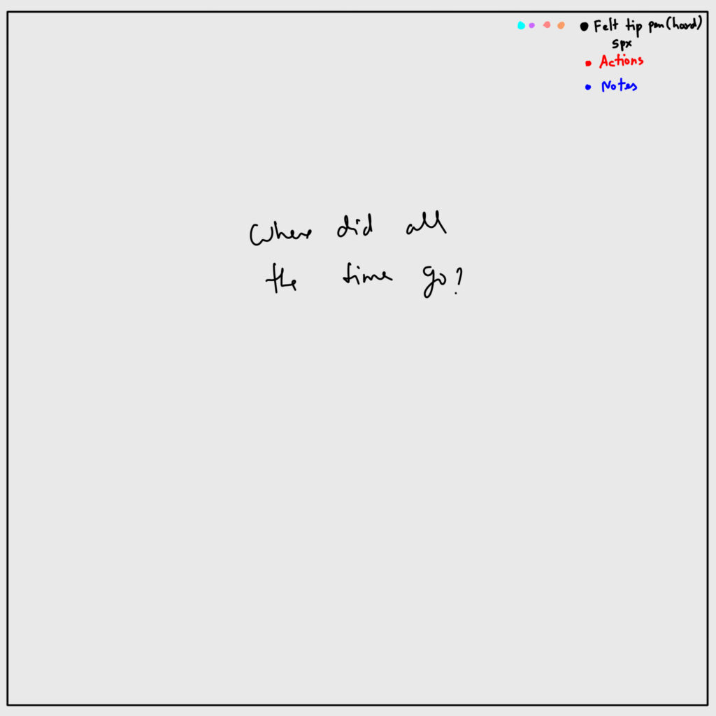
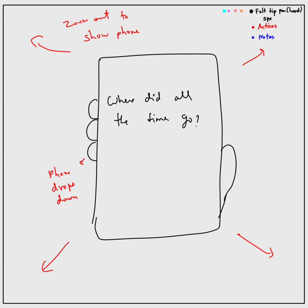
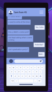
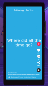
I divided the project into two parts. The first part was the introduction, which uses an animated reel to convey the idea of lost time and set up the premise of the experience. The second part was the interactive narrative itself.

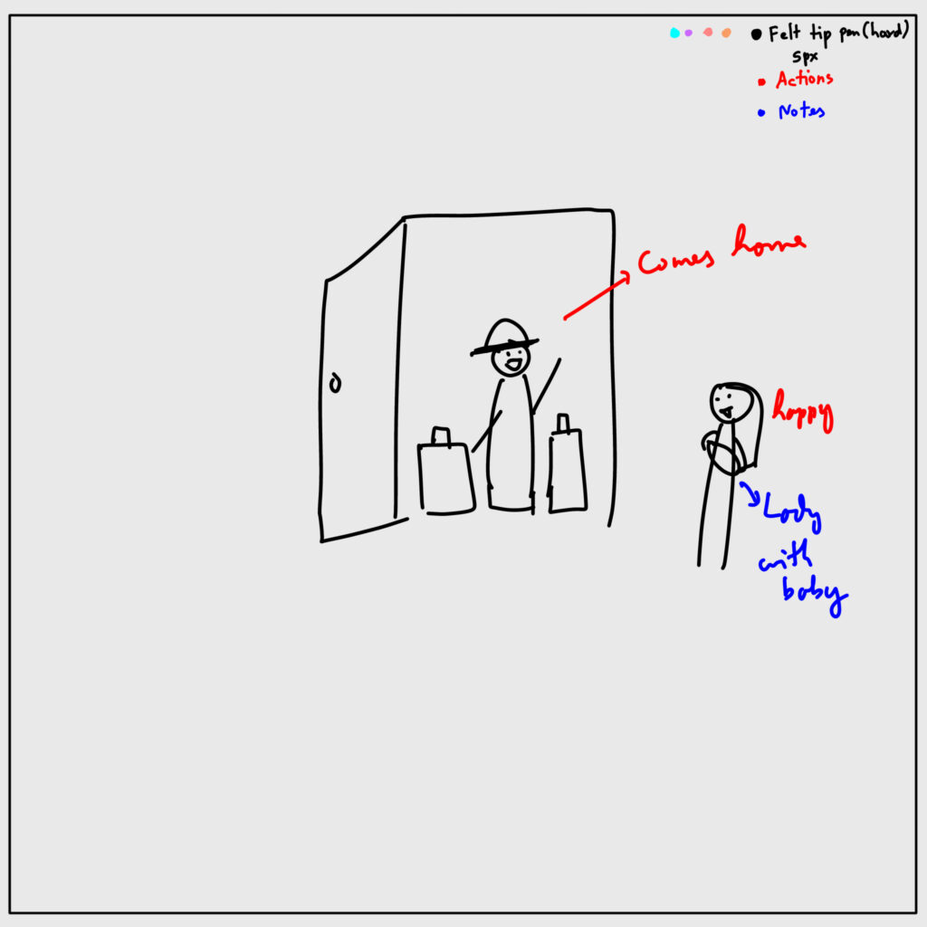
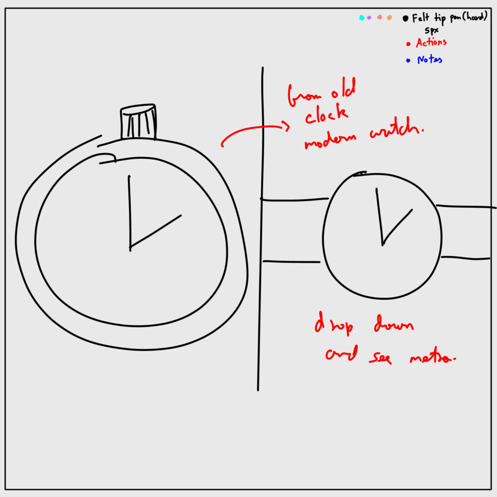
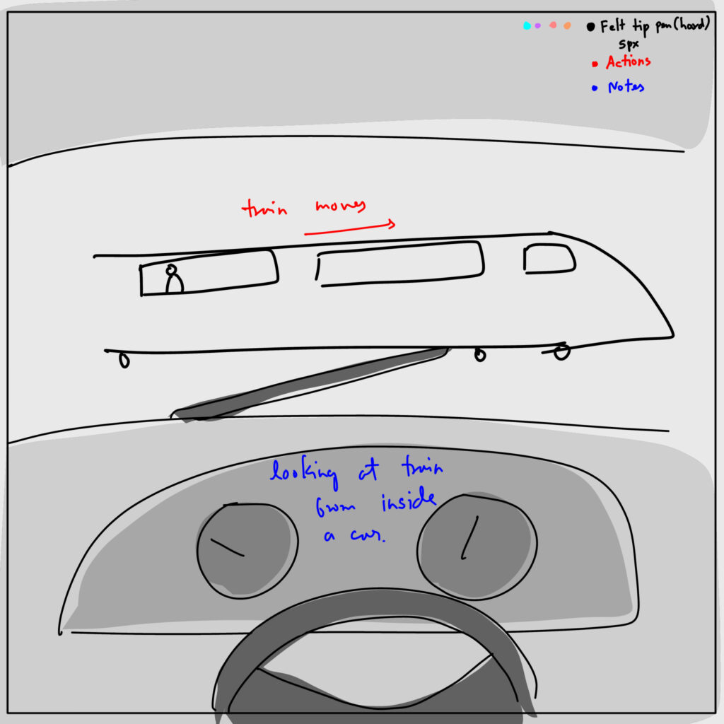
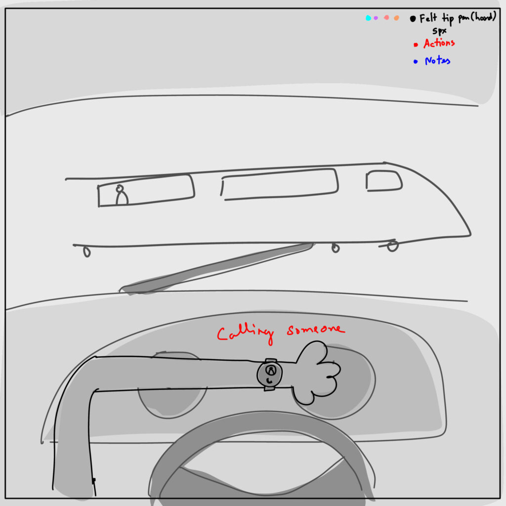
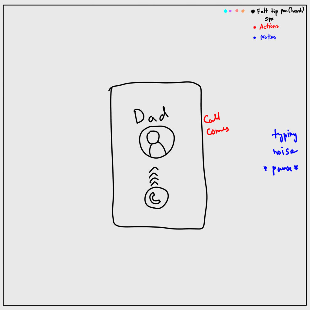
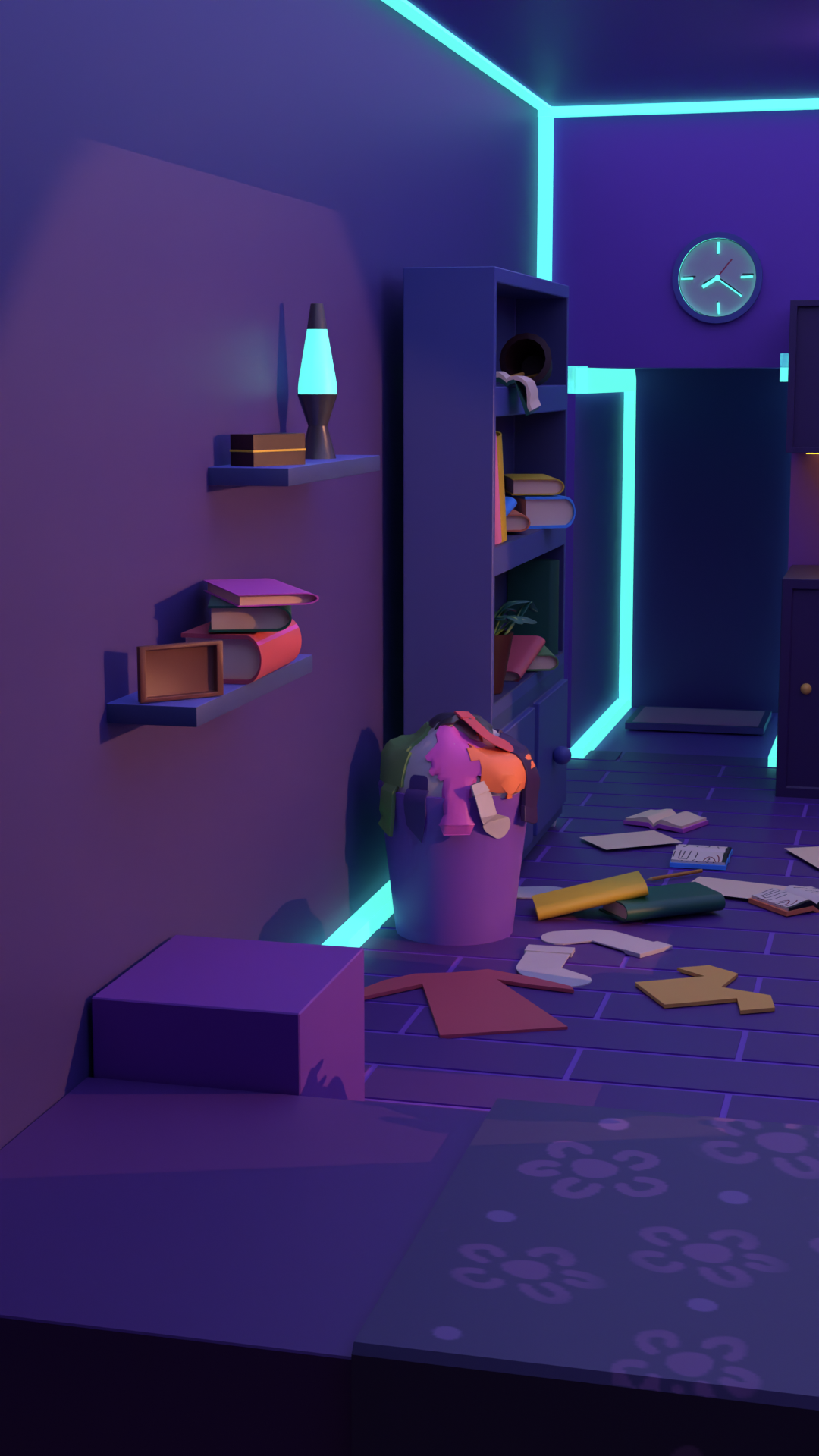
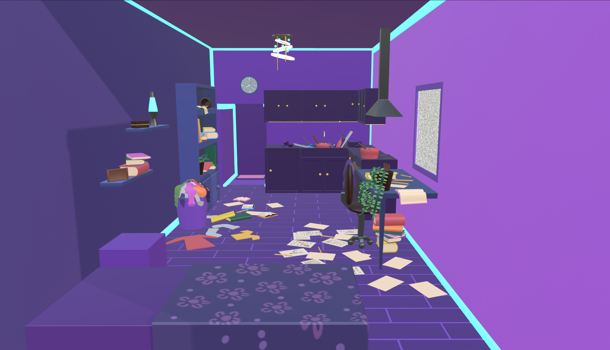
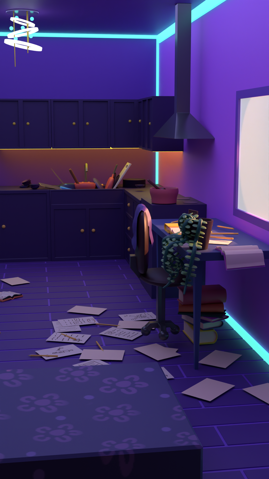
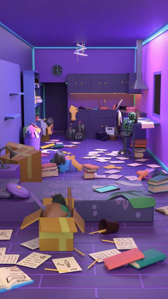
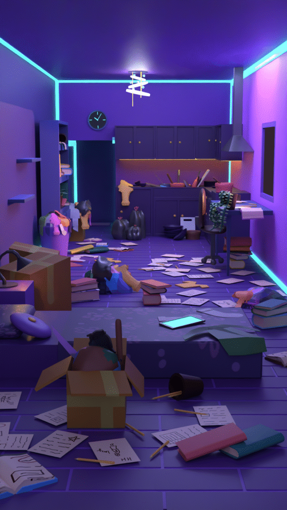
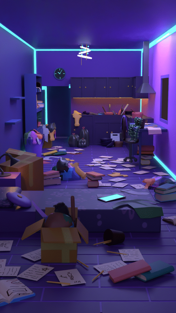
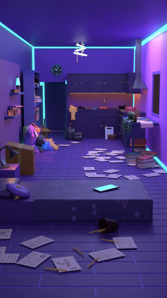
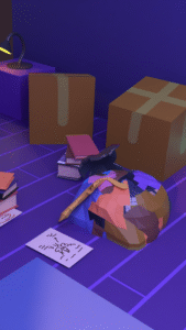
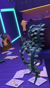
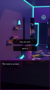
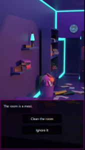
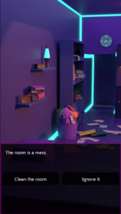
For the second part, I initially explored building the scene in a 3D space with a parallax effect, where the room would slightly shift in perspective based on cursor movement. During this phase, I created rough explorations to test how the space and interaction might feel.

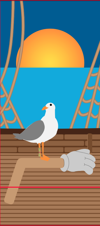
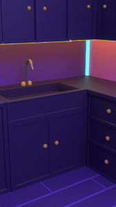
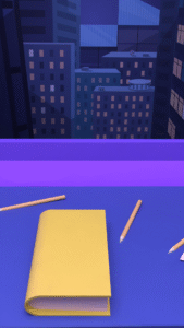
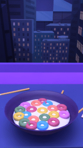
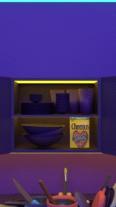
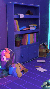
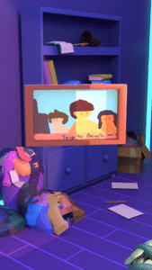
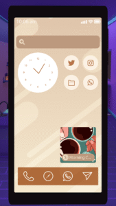
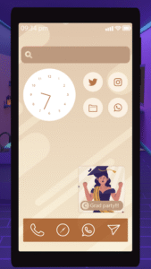
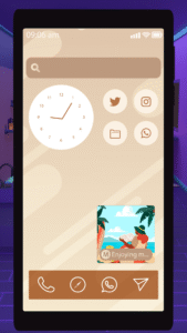
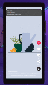
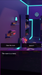
I also considered a journal or magazine-inspired visual style, where the scene would avoid highly saturated colors while maintaining a cozy atmosphere with cooler tones. This direction led to the final look of a cozy, cooler-shaded room with lighting that adds a modern touch.

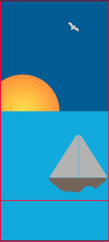
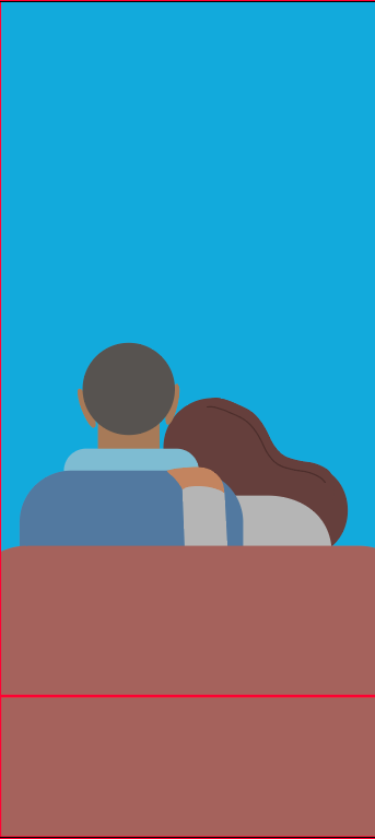
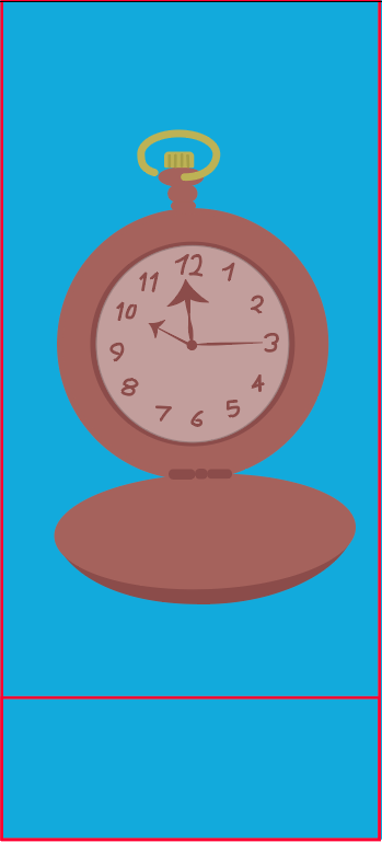
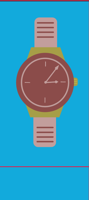
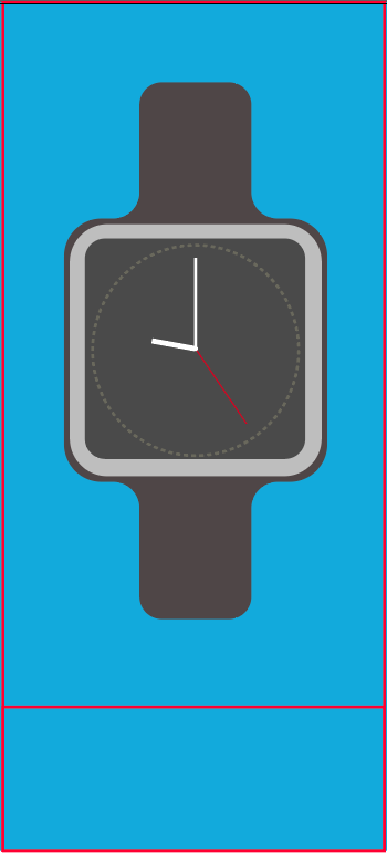
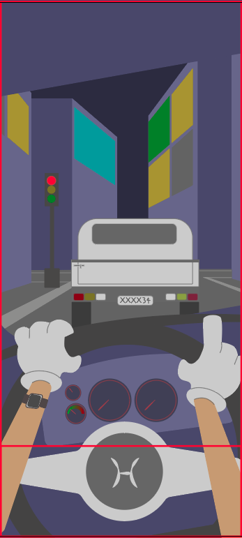
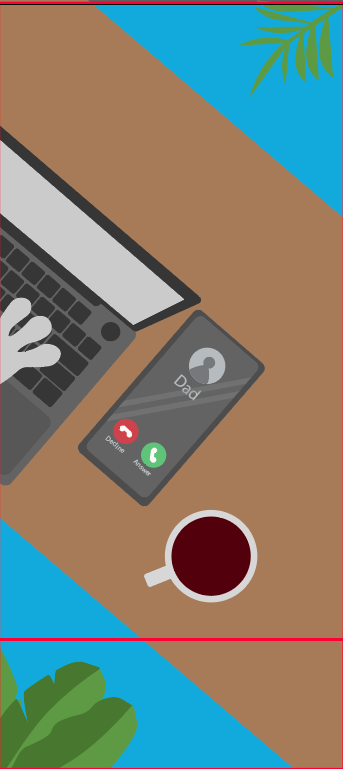
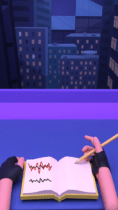
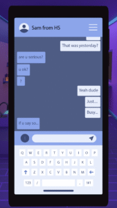
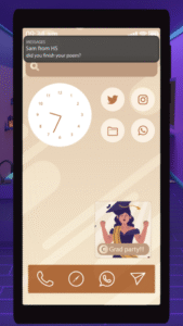
For the first part, the visual style was intentionally simple and more colorful. This contrast was used to reflect how reels grab attention by being brighter and more saturated compared to the calmer tone of the main scene.

Storyboarding and pacing planning

Storyboarding was particularly challenging, especially for the second part of the project. For the first part, I focused on creating a reflective sequence around the idea of “where does the time go,” implying that watching the reel itself contributes to that lost time. I shared my storyboard with Megan and revised elements that felt unclear or out of place. Since I wanted it to resemble a reel and it was my first time working in that format, I also sought guidance on designing for a phone resolution.

For the second part, I struggled for a while with how to structure the experience. I had established the core idea of a messy room and the objective of cleaning it, but I was unsure how to translate that into a clear sequence. Feedback from my peers played a key role during this stage, as they suggested different approaches and encouraged me to first create a rough version of the story.

Some suggestions included adding branching paths, but due to time constraints and this being my first time creating a game, I chose not to pursue that direction and instead kept the experience linear.

Illustration and asset creation

Most of the illustrations were created for part one, since that section required animation. I used simple visuals and shared them with Megan for feedback. Based on her input, I removed unnecessary strokes, kept only accent strokes, and fixed other inconsistencies she identified early on. I also included a red rectangle at the bottom of the frame as a guide to avoid placing important animations in that area. This was done to mimic a reel format, where text typically overlaps the lower portion of the screen, ensuring that key visuals would not be obstructed.

For part two, the initial version of the room was less cluttered and used a different camera angle. However, once I began implementing the game, I realized that the bottom one-third of the screen was being covered by text. To address this, I adjusted the camera angle to better accommodate the layout and ensure important elements remained visible.

Animations and motion design

I created the animations for the first part using Adobe After Effects. I aimed for a high level of polish, so I shared my work with Megan and incorporated her feedback. She pointed out even small details, which I was able to refine and improve.

For the second part, the animations were done in Blender. These were primarily transitional animations, such as objects entering the screen or the phone moving down, thinking, cooking, washing dishes, notifications, calls, etc., etc supporting the flow of the interactive experience.

Interaction design and implementation

This stage was initially challenging, as I was unsure which tool to use. I considered Unity for its 3D capabilities and Rive for its simplicity, but as a beginner in game development, I found it difficult to decide.

A peer suggested Twine, which aligned well with the type of experience I wanted to create. I was initially concerned about whether it would be suitable or difficult to learn, but I worked through it and successfully implemented the interaction.

During this process, I also explored different UI options and received feedback from Megan to refine them.

Iteration, refinement, and final polish

For this stage, I asked Megan and a few of my friends to go through the experience and share their feedback. Most of the feedback pointed out minor grammatical and spelling errors, which I corrected. Overall, the response was positive.

Some suggested adding background music to enhance the ambience of the experience, and a few minor adjustments were made to the animations based on their input.

STORY BOARD
ILLUSTRATIONS

ILLUSTRATIONS

exploring lights
Mess level
Different angles
Phone UI
UI Considerations
Twine
CONCLUSION & FUTURE SCOPE

This project explored how minimal interaction can foster deep emotional engagement, allowing me to translate a personal concept into a polished interactive format. By balancing narrative, animation, and implementation, I learned to manage scope effectively, prioritizing a linear structure and a single environment to ensure a focused, high-quality experience. Feedback from my advisor and peers was instrumental in refining the narrative clarity and overall execution.
Looking ahead, I plan to expand the project by introducing customization features, such as a menu for audio and text speed settings. I also aim to develop branching narratives—such as an in-person visit if a phone call is declined—and diverse ending activities like cooking or decorating. These additions would offer alternative ways to experience the core message while deepening the user’s connection to the story.

CREDITS

Advisor
I would like to thank Megan Friesth for guiding me throughout this entire project. I felt consistently supported, and she took the time to carefully review my work and provide meaningful feedback. Her guidance helped me stay on the right track, and whenever I felt stuck or unsure, she offered ideas that helped me move forward.

Sounds & Audio
Ocean sound effect
Sound Effect by freesound_community (Pixabay)
Gentle music
Sound Effect by Bomb Sound (Pixabay)
Voiceovers
ElevenLabs AI
Phone notification
Sound Effect by freesound_community (Pixabay)
Additional ambient sounds by Pixabay:
Traffic noise, clock ticking, nature sound, ocean sound, phone ringing
Speak sounds:
Speak1 (Narrator) – CreatorsHome (Pixabay)
Speak2(MC) – freesound_community (Pixabay)
Speak3(Clair) – freesound_community (Pixabay)
Hunger sound – Kuzu (Pixabay)
Washing dishes – freesound_community (Pixabay)
Cooking – freesound_community (Pixabay)
Clothes – freesound_community (Pixabay)
Unpacking – freesound_community (Pixabay)
Books – Semen Surin (Pixabay)
Washing machine – Vicki Hamilton (Pixabay)
Trailer sound – OpenMindAudio (Pixabay)


Music
Day 3 ambience – Dawn by Alegend
Day 2 ambience – Dark Heart by Walen
Day 1 ambience – A Sweet Story by Guillermo Guareschi
Intro ambience – Vibing by Pufino
Ending – Heroes by Sunova
(Source: freetouse.com – Free/royalty-free music)


Illustrations
Texting UI – Freepik
Grad party image – Freepik

LIKED THIS ONE?

Explore More Work

Thanks for checking out this project! If you’re curious to see what else I’ve been working on – from motion design experiments to playful tech builds – feel free to take a look at some of my other projects below.