MADE FOR WHAT OTHERS DON’T SEE

Unseen

pROJECT OVERVIEW

“How might we create a safe space for people to share their experiences and support each other?”

I have suffered from hyperhidrosis since childhood – a medical condition that causes excessive sweating, often beyond what is necessary to regulate body temperature. Throughout my school years, I was criticized by teachers and friends for my sweaty hands. Local doctors were often unaware of the cause or dismissed it as a minor issue, leaving me feeling isolated and misunderstood.

It wasn’t until I discovered the online community r/hyperhidrosis that I realized I wasn’t alone. Finding others who shared similar struggles made me feel seen and validated for the first time. This experience inspired me to create a project that gives back to the community that supported me.

This project, initially focused on hyperhidrosis, has now evolved into a broader platform supporting individuals with underrepresented skin and sweat-related conditions. The goal is to provide education, community support, and enhanced access to resources through an intuitive, empathetic mobile app.

TARGET AUDIENCE

Individuals living with hyperhidrosis or related skin/sweat conditions seeking support, resources, and community.

Friends, family, partners, and coworkers who want to better understand and support someone close.

Healthcare providers and advocates are interested in improving awareness, education, and treatment accessibility.

EXPECTED OUTCOMES

Empower users by providing a safe, supportive platform where individuals with hyperhidrosis and related conditions can connect, share experiences, and find validation.

Increase awareness among the general public and healthcare professionals about the real impact of hyperhidrosis and similar conditions.

Facilitate access to treatments, doctors, coping strategies, and community-driven advice by building a trustworthy and centralized hub.

Grow a self-sustaining community that not only supports individuals but also sparks future advocacy, awareness campaigns, and improved healthcare responses.

TIMELINE

Understand

Began by identifying core pain points through quick surveys and informal interviews with individuals affected by hyperhidrosis.

Research

Analyzed the feedback to uncover emotional, social, and practical challenges. Grouped insights into common themes to guide design direction, called affinity mapping.

Ideate

Developed key user flows and golden paths, focusing on features that would inform, support, and connect users.

Design

Moved from low-fidelity wireframes to polished high-fidelity visual designs, keeping accessibility and tone front and center.

Test & Iterate

Shared early mockups with users and peers for feedback, refining both visual and functional details.

Reflect & Grow

Documented key takeaways and outlined future opportunities – both for the product and for how I approach human-centered design.

SURVEYS & INTERVIEWS

To begin, I shared a Google Form to collect initial responses and identify potential participants for deeper interviews. The form helped narrow down users based on their experiences and willingness to be contacted for follow-up conversations. Conducting these interviews was one of the most engaging parts of the process – I got to meet new people, hear honest stories, and felt genuinely connected to the topic and the community I was designing for.

AFFINITY MAPPING

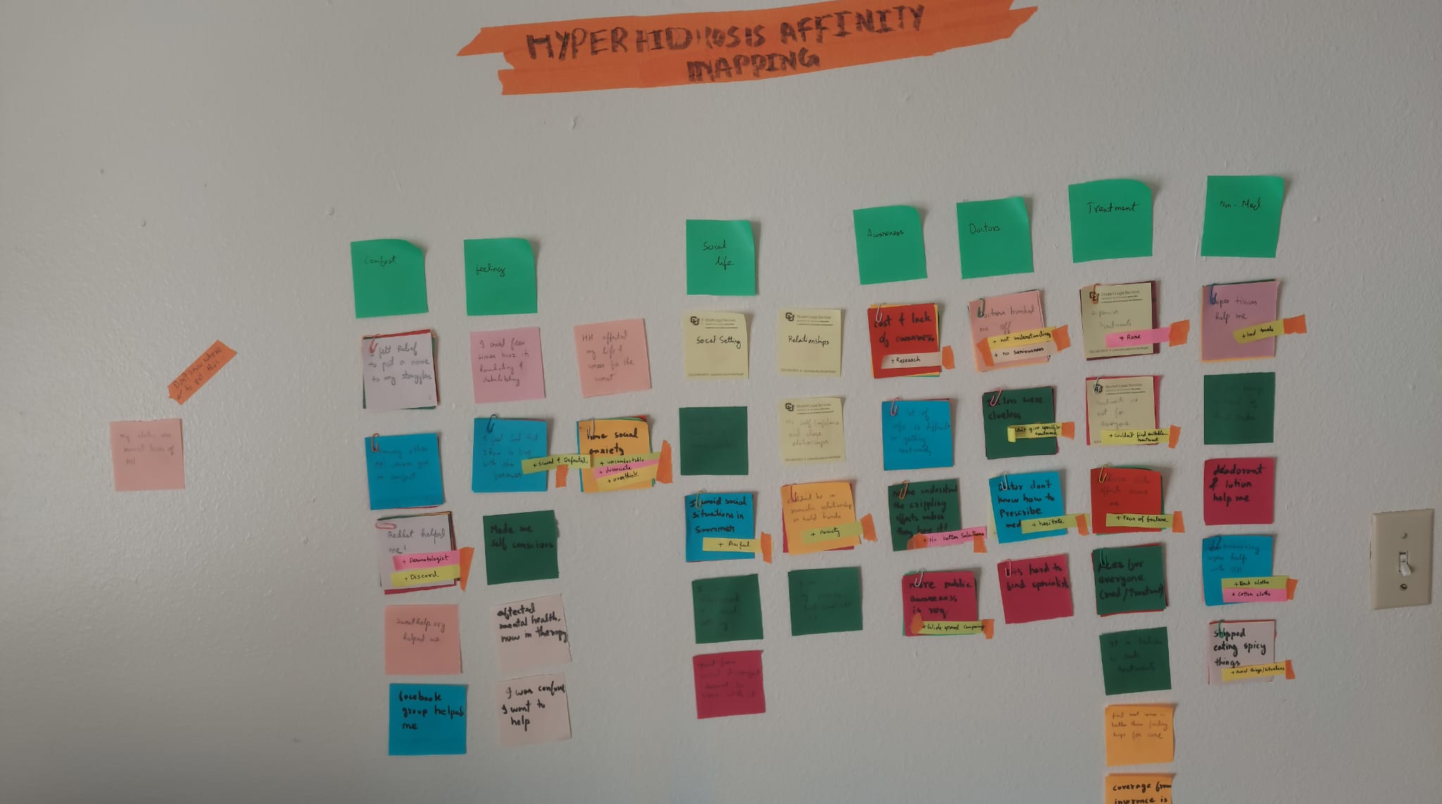
After conducting surveys and interviews, I categorized the collected insights into seven major themes. This affinity mapping process helped identify key user pain points and opportunities to address them through design.

KEY FINDINGS

To understand the real-life experiences of people living with hyperhidrosis, I created a Google Form and shared it across Reddit (r/hyperhidrosis), Facebook groups, and Discord communities. The form helped me filter participants who were willing to speak further. I then conducted one-on-one Zoom interviews to dive deeper into their struggles, emotional experiences, and unmet needs.

Lack of Awareness and Medical Recognition

Many participants reported being dismissed by doctors or misdiagnosed entirely.

Isolation and Social Anxiety

The emotional toll of living with HH was a recurring theme. People felt isolated, embarrassed, and unsupported.

Access Barriers to Treatment

Treatments are often expensive, inaccessible, and poorly understood by local professionals.

The Power of Community

Many users expressed a desire for a space where they could be heard, share stories, and learn from others.

TESTIMONIALS

Words from Interviews​

NOTES
USER NEEDS
  • Awareness
  • Feel like they are heard
  • Sense of belonging
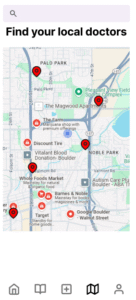
  • Finding suitable local doctors/treatments
FEEDBACK FROM PROFESSOR

Zoom out a little, focus on conditions like HH, and not just HH.

GOLDEN PATH
dESIGN RATIONALE

Each screen was designed with the following principles in mind:

  • Empathy and Safety First: Anonymity is preserved throughout.
  • Low-Friction Onboarding: Users can start exploring immediately.
  • Personalization Without Pressure: The “For You” page adapts gently over time.
  • Community-Led Validation: Users feel less alone and more informed via shared stories and ratings.
LOW-FIDELITY WIREFRAMES

In the early stages, the focus was entirely on conceptual clarity over visual detail. Instead of color and style, I prioritized the information structure, user flow, and interaction intent. The key aim was to validate the golden path before refining the visuals.

The core user journey was built to address the emotional and practical needs surfaced during the research phase-especially the lack of awareness, emotional isolation, and difficulty finding accessible care. The flow begins gently, offering optional onboarding, then guides users to explore community support and discover treatments tailored to them.

Splash Screen + Optional Account Creation

Users can log in with an email or skip sign-in entirely. Anonymous usernames preserve user comfort and safety.

Initial Personalization (Optional Form)

Asks about the user’s condition(s), severity, and location. This data powers the personalized “For You” experience and doctor discovery.

Home (For You Page)

Curated mix of treatment tips, user stories, and relevant articles. Evolving feed tailored to the user’s condition.

Community Page

Anonymous posts, discussions, shared struggles. Image uploads and comment support create a sense of safe belonging.

Support & Local Doctors

Filter by location, condition, doctor rating, or treatment type. Users can leave anonymous reviews to help others.

Education Hub

Curated, expert-backed articles and real-user hacks. Separated into tags or categories for easy navigation.

ITERATION NOTES

Initially, I considered adding a “Friend Finder” feature to help users directly connect with others. However, I decided against it in this version due to potential security and moderation concerns. This feature is being considered for future versions with stricter safety controls.

The navigation design evolved to prioritize simplicity and privacy, ensuring users never feel overwhelmed.

PROTOTYPE

The high-fidelity prototype focuses on building a space that feels safe, informative, and personalized for users living with hyperhidrosis and related conditions.

Visual Design & Accessibility

Based on user insights, I chose a dark theme for the app, as many individuals with hyperhidrosis prefer wearing dark clothing-especially black-to hide visible sweat stains. This color scheme felt both familiar and comforting. I also ensured accessibility compliance, particularly with text-to-background contrast, to support readability across different conditions and lighting environments.

Key Iterations Based on Feedback

Initially, the app opened on the Community page, but based on feedback, I reworked the home screen to feature a personalized “For You” page as the new landing screen. This page acts as an educational hub with relevant treatment stories and better aligns with user goals. I also introduced a new feature that allows users to review local doctors and treatments, helping others make informed decisions and avoid the trial-and-error cycle many currently face.

Features

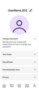
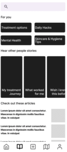
  • Optional profile form for personalized recommendations.
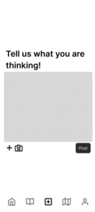
  • Community page for anonymous posting and shared stories.
  • Education hub with articles, hacks, and treatment tips.
  • Doctor finder with filters for condition, severity, and location.
  • Review system for treatments and healthcare providers.
CONCLUSION & FUTURE SCOPE

This project was shaped by the voices and needs of the hyperhidrosis community, resulting in a product that offers personalized content, peer-reviewed treatment insights, and a safe, anonymous space for sharing experiences. It bridged an awareness gap-not just for those living with hyperhidrosis, but also for doctors and the general public-and created a trusted hub for education, connection, and support. Along the way, I learned how even small design choices, like color and tone, can significantly impact emotional comfort and trust. Most importantly, I realized that community feedback isn’t just helpful-it’s essential for meaningful, human-centered design. Looking ahead, I hope to expand the app’s features with moderated peer chat, treatment tracking tools, and richer educational content like expert interviews and explainer videos.

LIKED THIS ONE?

Explore More Work

Thanks for checking out this project! If you’re curious to see what else I’ve been working on – from motion design experiments to playful tech builds – feel free to take a look at some of my other projects below.